Type Specimen
OVERVIEW
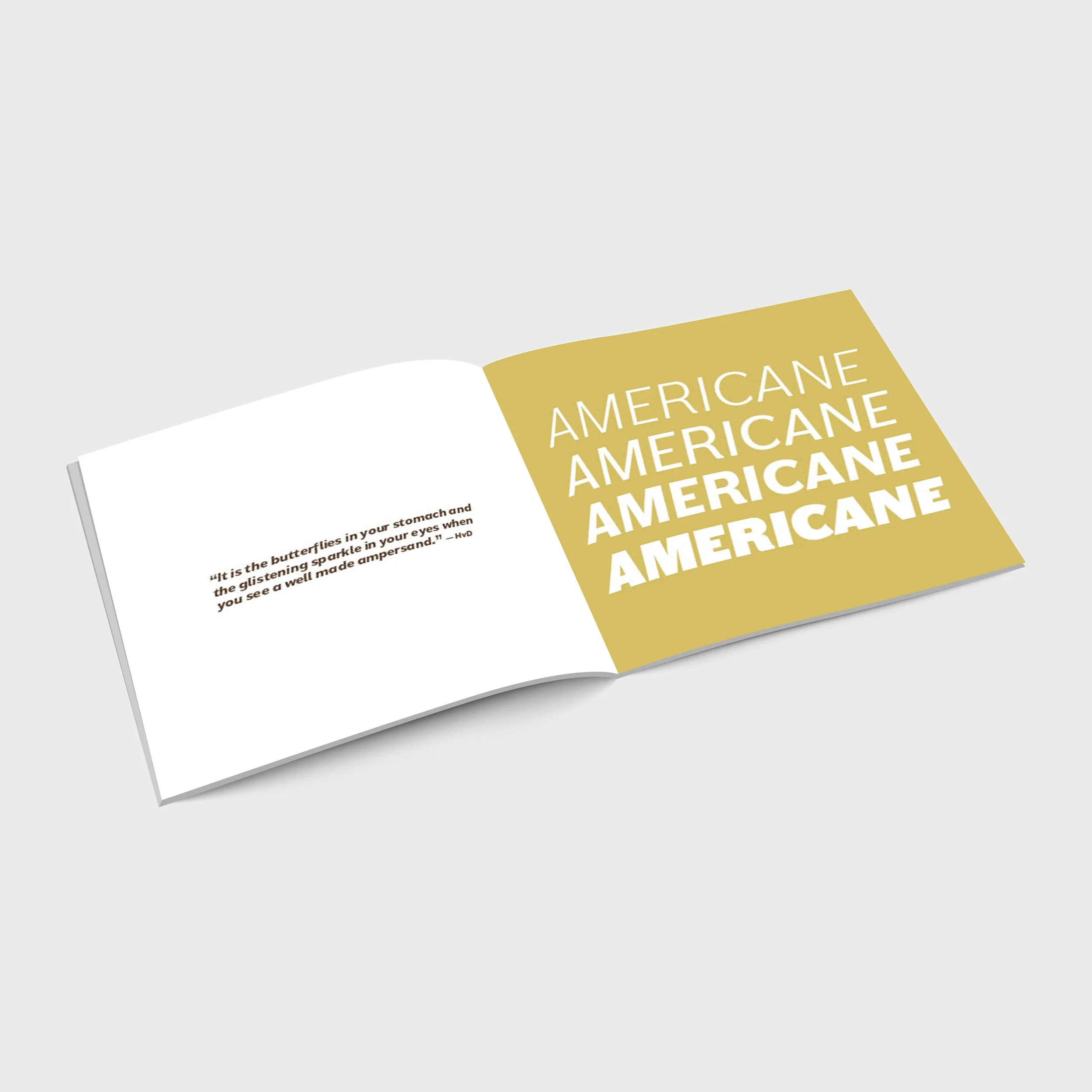
For this project, I was tasked with researching a typeface and designing a unique booklet that highlights it. One thing I admired about my chosen typeface, Americane, was its versatility amongst weights.
It starts off shy at lighter and regular weights, appearing as a simple sans serif font. But its personality starts to shine through in its heavier bold and black weights. Americane Black in particular shows off a strong, edginess that doesn’t feel too corporate which is something you don’t get with other bold sans serif fonts.
I wanted to highlight its versatility throughout my booklet by showcasing its four different weights and utilizing a thick line in copy heavy areas. The line is not only a simple design choice, but acts as a small element that expresses Americane’s personality.
ROLE
Designer, editor
TOOLS
Adobe InDesign


